Backgrounds are a fun way to add life to your piece, and in some scenarios in this species, are a requirement for prompts. For our species, there are 3 classifications of backgrounds: Simple Patterns / Shapes / Gradients, Simple Background, and Complex Background.
Simple Patterns / Shapes / Gradients:
- Backgrounds composed of very simple concepts. These can add some fun elements to a piece, but are NOT counted towards background bonus rewards in prompt submissions. Some examples of a Simple Pattern / Shape / Gradient Background would be:
- Solid colors, transparent backgrounds, or gradients with no sense of scenery
- Random shape placement or shapes without any additional scenery
- Repeating patterns of just solid or gradient colors
- Props without additional elements, for example, a single strawberry
Simple Background:
- Backgrounds composed of limited elements, but enough to give a sense of scenery and don't necessarily have depth. These kinds of backgrounds are very 1-dimensional, but you can tell the character is somewhere. Some examples of a Simple Background would be:
- Very blurry distant details. There's clearly a type of scenery, but you can't quite tell what it is
- Limited details such as a ground / floor and a sky / wall; can have lesser details such as clouds or a sun
- Limited detail angles / scenarios, such as lying in the grass, flying in the sky, or swimming in an empty ocean
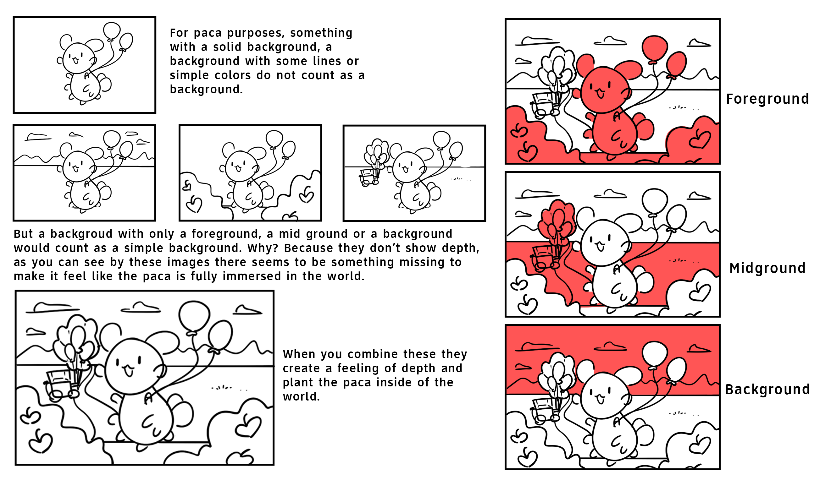
Complex Background (AKA ~ "Background With Depth") :
- Backgrounds composed of more detailed elements, having a distinct background and midground, and can occasionally have the optional foreground. Some examples of a complex background would be:
- Clear depth applied to the scene. This can be as simple as a grassy field with a tree, distant hill, and distant house
- Very detailed scenarios with lots of props and elements to give the scene a more unique feel
- Complicated pespective angles, such as 2-point perspective looking upwards, or a fisheye lens shape
TIPS
- Backgrounds can seem intimidating to even the most advanced artists. A good way to learn different techniques is by practicing with nature scenes. Nature is always changing, and almost never perfect, and therefore will always look nice. Playing around with nature scenery can allow you enough wiggle room to learn prop / character placement, perspective, and various types of lighting!
- Focus less on the unimportant details and more on what's going to directly noticed at a glance. This can help you cut frustratingly long background times drastically. If you have a rose garden piece, if you make every rose super detailed, the piece can get extremely loud and hard to focus on just one thing. Using the metaphorical rose garden still, try making roses closer to your focal point detailed, while things further away that you don't want people to immediately look at can be as simple as a messy circle with a second shadow color scribbled on it.
- You will be looking at your piece for far longer than anyone else will, so perfectionism isn't a requirement for backgrounds for anyone but you. As long as it's clear what something is, then it's already perfect!
- Try playing with various brushes and shapes. This can help you find a comfort zone, tools you like, and can make backgrounds much less of a headache.
- Figure out your lighting setting ahead of time. This can help you figure out what kinds of colors to use where, and how to apply shadows to your piece. Is the piece a warm sunset? Try oranges, pinks, and purples. Maybe you want a cool summer night in a dark forest? Try muted blues, greys, and black.
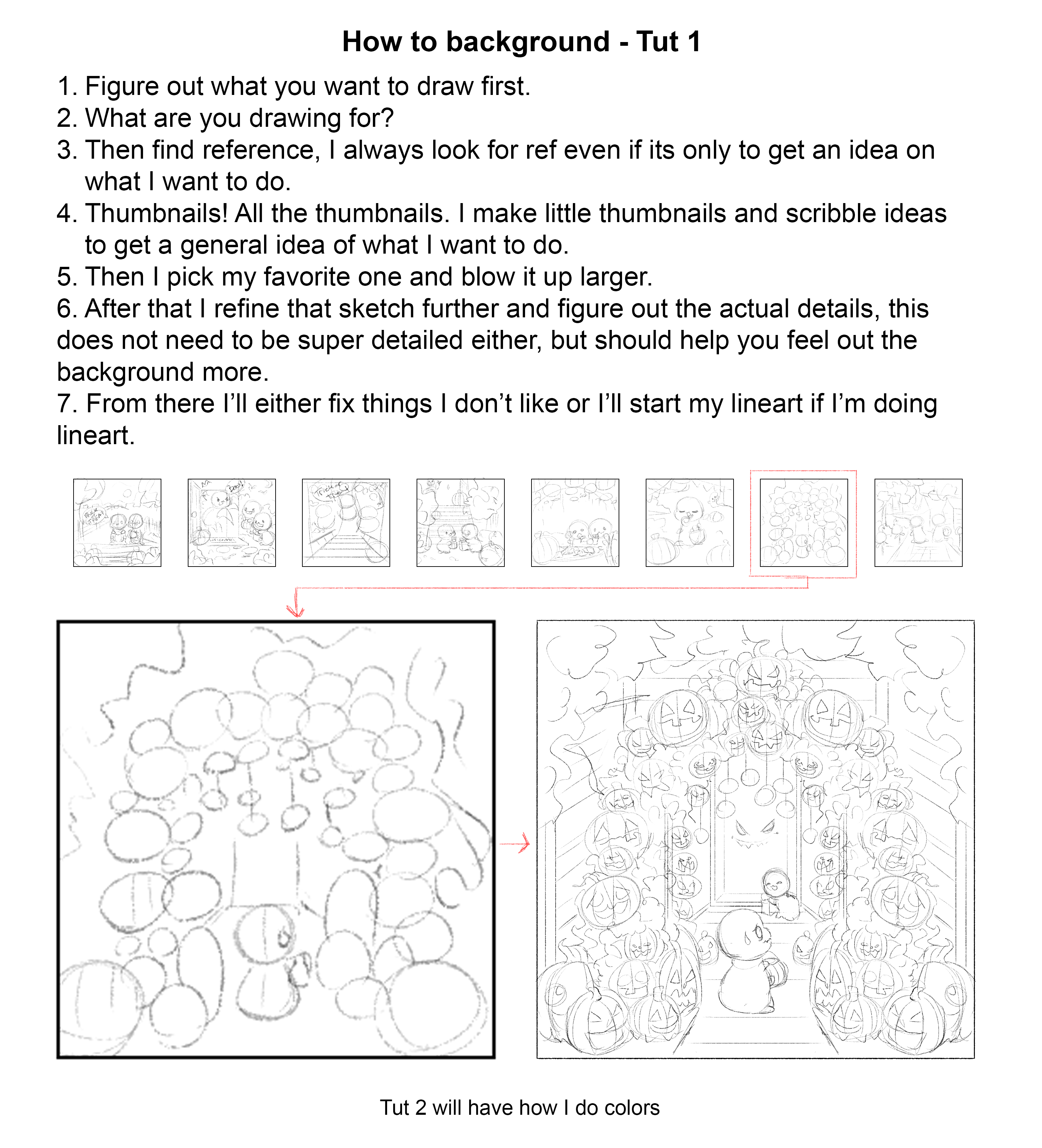
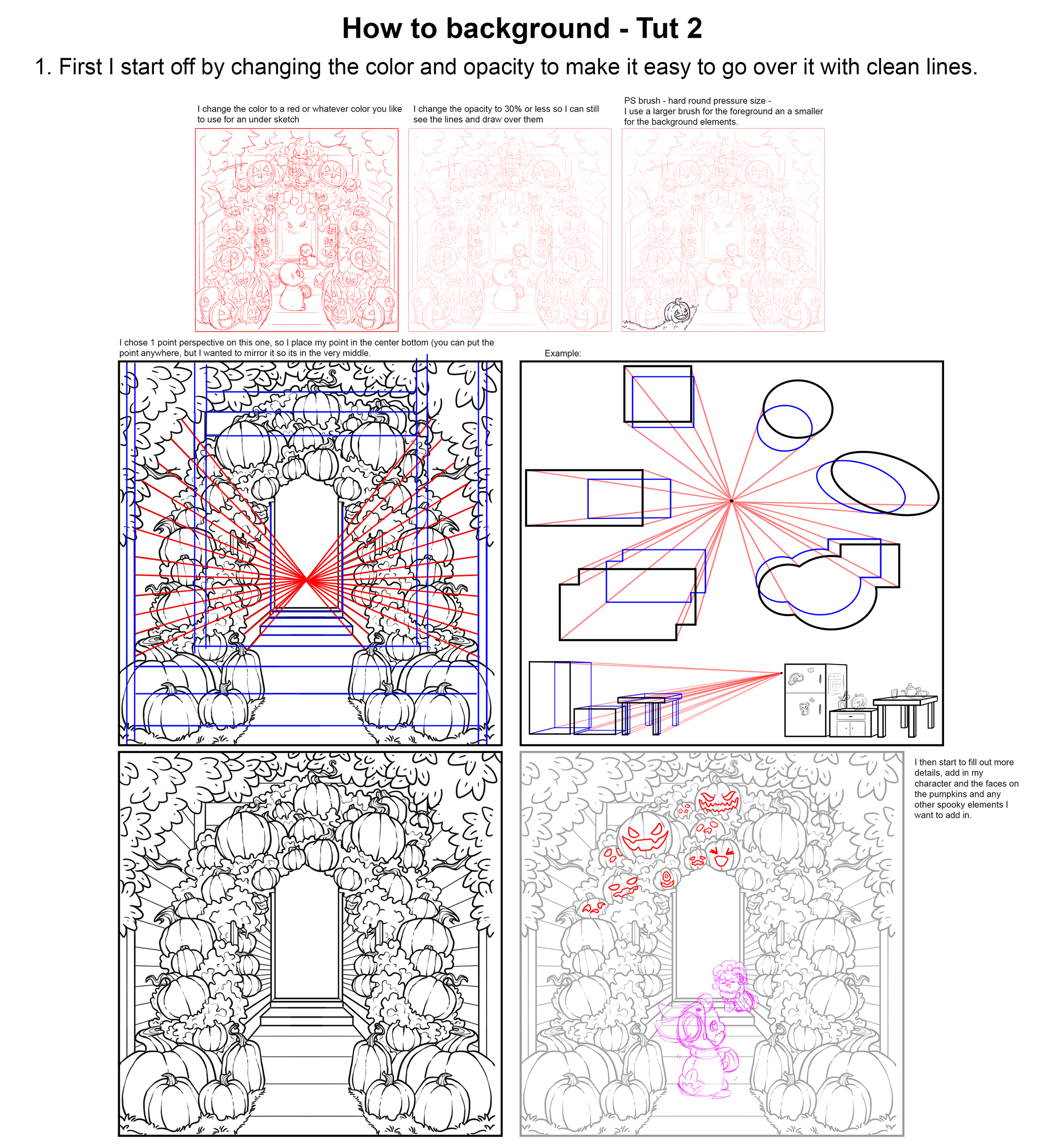
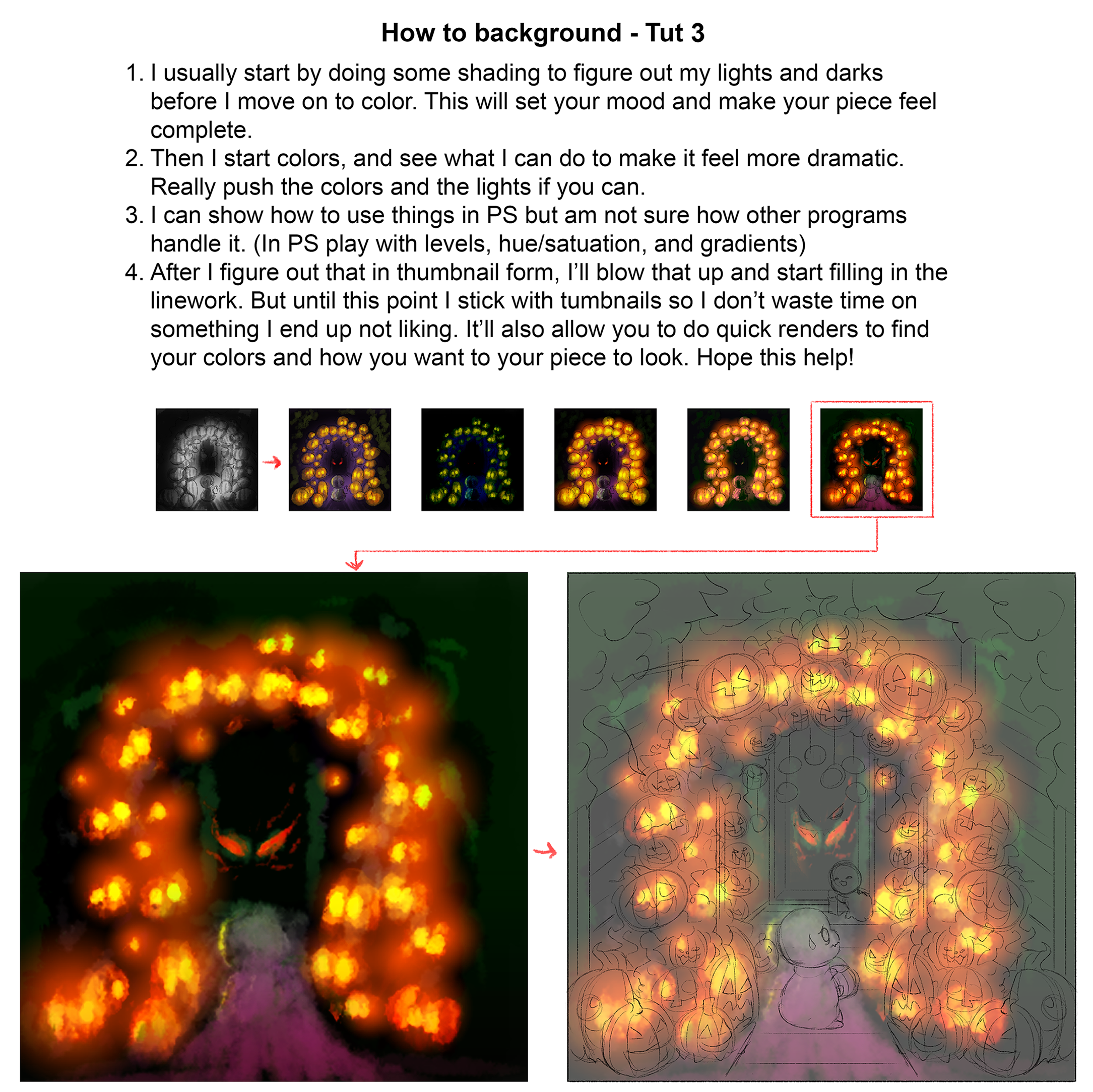
Our user, grifforik , has created some awesome guides to help with creating backgrounds, so please feel free to check out their helpful tutorials!
Submitted By Admin
・ View Favorites
Submitted: 1 year ago ・
Last Updated: 5 months ago